Introduction
Web development is not just about aesthetics and functionality, it’s also about ensuring accessibility. Accessibility means everyone can access your website, including people with disabilities. One important aspect of accessibility is color contrast - ensuring that there is enough contrast between text and background colors to ensure readability. Enter Color Contrast Checker, a tool that helps developers ensure accessible web design through proper color contrast.
What is Color Contrast Checker?
Color Contrast Checker is a tool that analyzes the color contrast between two colors - typically text and background colors - to ensure that they meet accessibility standards. These standards are outlined in the Web Content Accessibility Guidelines (WCAG). Color Contrast Checker checks the contrast ratio between the two colors and provides a pass or fail result based on whether the contrast ratio meets the minimum requirements outlined in WCAG.
How does Color Contrast Checker work?
Color Contrast Checker works by calculating the contrast ratio between two colors. The contrast ratio is calculated using a formula that takes into account the luminance values of the two colors. The contrast ratio can range from 1:1 (no contrast) to 21:1 (maximum contrast). WCAG defines minimum contrast ratios for different text sizes - for example, large text (18pt or 14pt bold) should have a minimum contrast ratio of 3:1, while normal text (below 18pt) should have a minimum contrast ratio of 4.5:1.
Using Color Contrast Checker
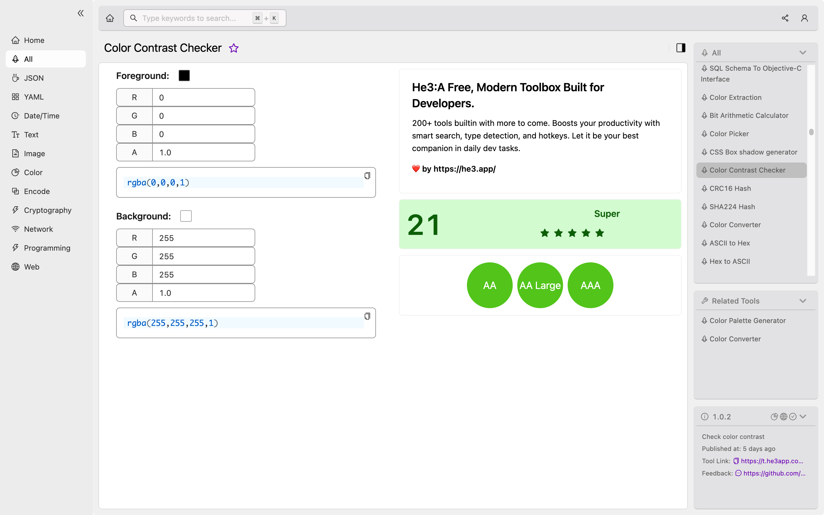
Color Contrast Checker can be used in a number of ways. One common way is to copy and paste the hex values of the two colors you want to check into the tool, and it will return a pass or fail result along with the contrast ratio. Or you can use Color Contrast Checker tool in He3 Toolbox (https://t.he3app.com?g4lg) easily. A screenshot of the Color Contrast Checker in He3 Toolbox is shown below:
Scenarios
Developers can use Color Contrast Checker in a number of scenarios. For example:
- When designing a new website, developers can use Color Contrast Checker to ensure that the color scheme meets accessibility standards.
- When making updates to an existing website, developers can use Color Contrast Checker to check the contrast between any new colors that are introduced.
- When working with clients or stakeholders, developers can use Color Contrast Checker to demonstrate the importance of accessible design.
Key Features Table
Here are some key features of Color Contrast Checker:
| Feature | Description |
|---|---|
| Accessibility standards | Color Contrast Checker checks against WCAG minimum contrast ratios for different text sizes. |
| Hex value input | Developers can input colors using their hex values. |
| Pass/fail result | Color Contrast Checker returns a pass or fail result depending on whether the contrast ratio meets the minimum requirements. |
| Contrast ratio calculation | Color Contrast Checker calculates the contrast ratio between two colors. |
| User-friendly interface | Color Contrast Checker has a simple, easy-to-use interface. |
Misconceptions and FAQs
Misconception: Color Contrast Checker only applies to people with visual impairments.
Accessibility is not just about visual impairments. It also includes people with cognitive and motor impairments, as well as people with temporary disabilities such as a broken arm. Ensuring proper color contrast can help make your website more accessible to everyone.
FAQ 1: Does Color Contrast Checker work with all types of color combinations?
Color Contrast Checker works with most types of color combinations. However, it may not be accurate for certain types of colors such as gradients, patterns, or images.
FAQ 2: Can I trust Color Contrast Checker to ensure accessibility?
Color Contrast Checker can help you ensure that your website meets WCAG minimum contrast ratios. However, it is just one tool in a developer’s toolkit for ensuring accessibility. It’s important to keep in mind that accessibility is a holistic approach, and there are many factors to consider beyond just color contrast.
Conclusion
Color Contrast Checker is an important tool for developers who want to ensure accessible web design. By calculating the contrast ratio between two colors and checking against WCAG minimum standards, developers can ensure that their website is readable for everyone. To learn more about accessibility and other tools for ensuring it, check out the WCAG website (https://www.w3.org/WAI/standards-guidelines/wcag/).

